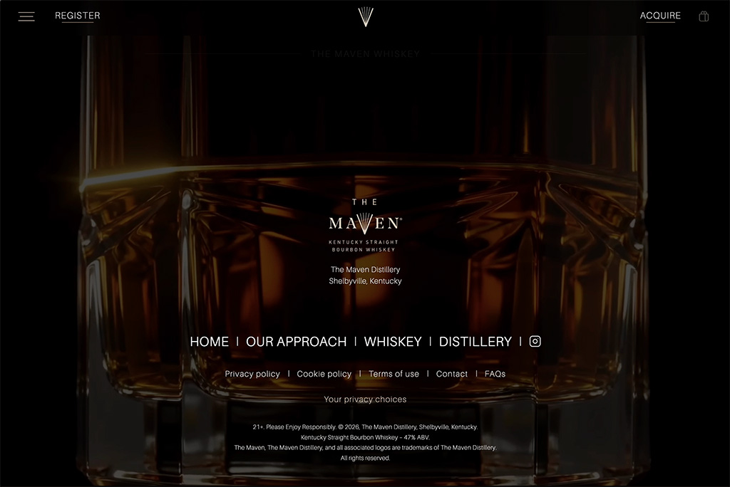
Two days after a limited release to critics, The Maven Kentucky Straight Bourbon Whiskey scored 99 points and a Double Gold at the 2026 San Francisco World Spirits Competition. The whiskey world took notice.
The Maven team had the liquid, the bottle and the label. They needed a digital home that brought the brand to life in time for the public launch. The Maven asked Supermoon to design and build the site.
Learn more on the Maven website.
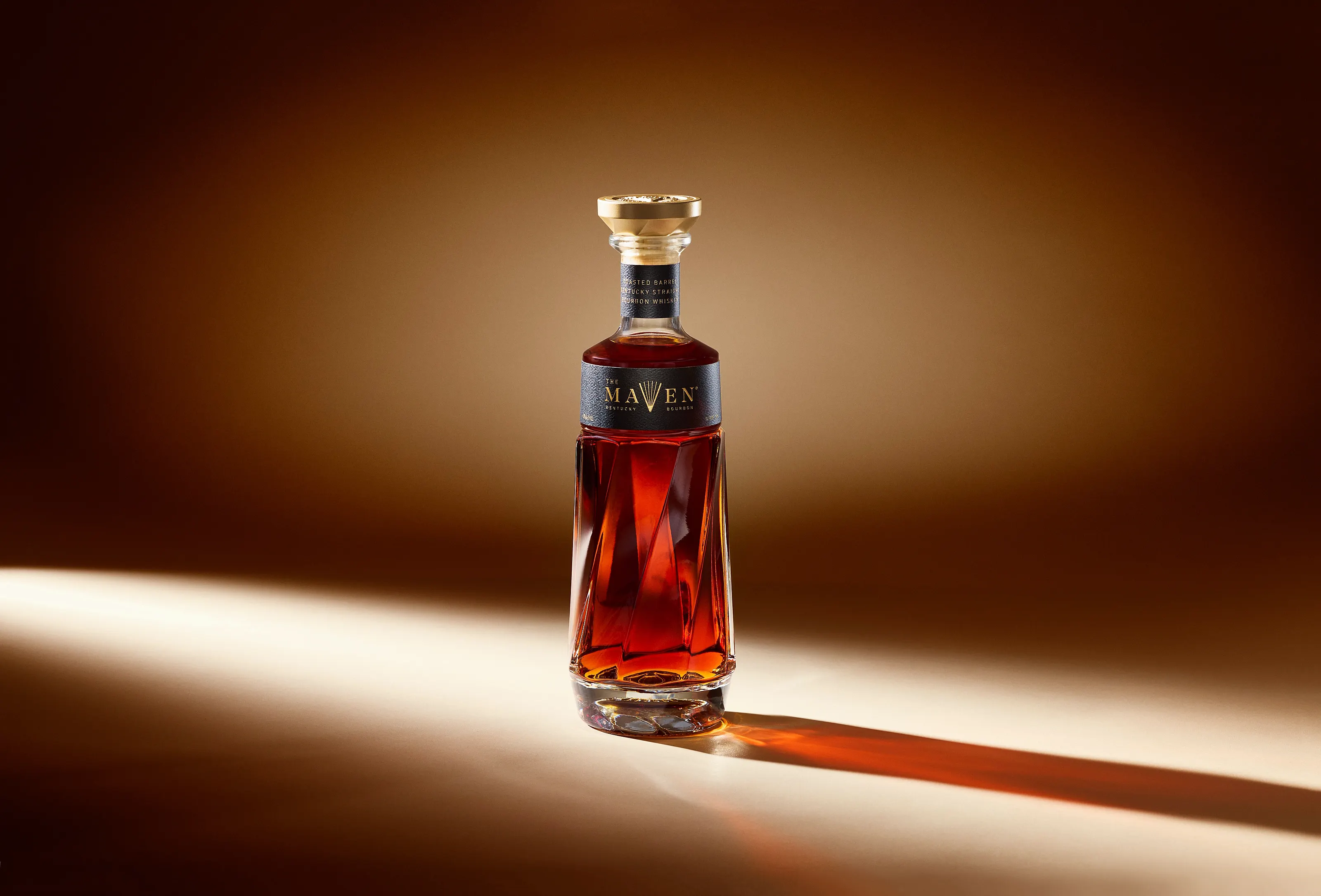
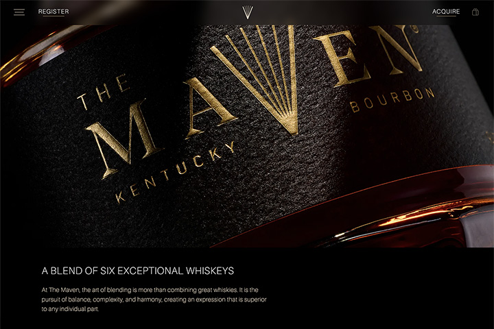
The Maven's faceted bottle instantly signals luxury. The site had to build on that signal while explaining the science of blending, the brand's key differentiator.
Art, meet science.
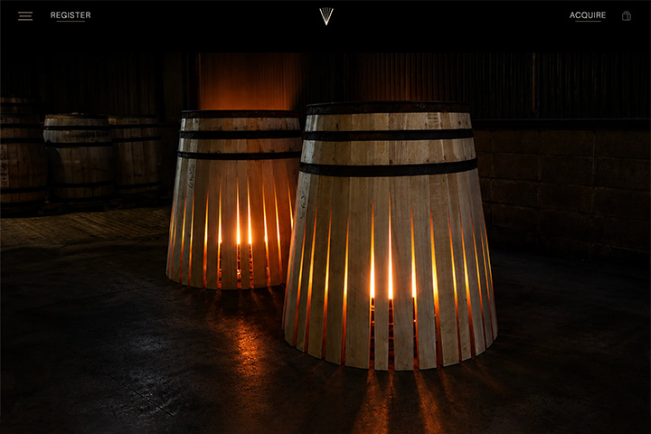
At the Maven, an expert team blends six bourbons from one of America’s most extensive private whiskey libraries. Each whiskey matures for at least seven years in toasted barrels made from one of five species of white oak. It's a story of deep knowledge, craft and precision.
A modern luxury brand that stands out.
High-end Kentucky bourbons usually lean on 19th-century styling or classic Americana. The Maven takes a different route: a modern luxury brand with a distinctive visual system.inspirationm the great Champagne houses, ultra-luxury carmakers and fine watchmakers, where the story unfolds as you experience it. Each scroll reveals the next chapter: the selection, the blend, the oaks, the people, the provenance.
Help enthusiasts go deeper.
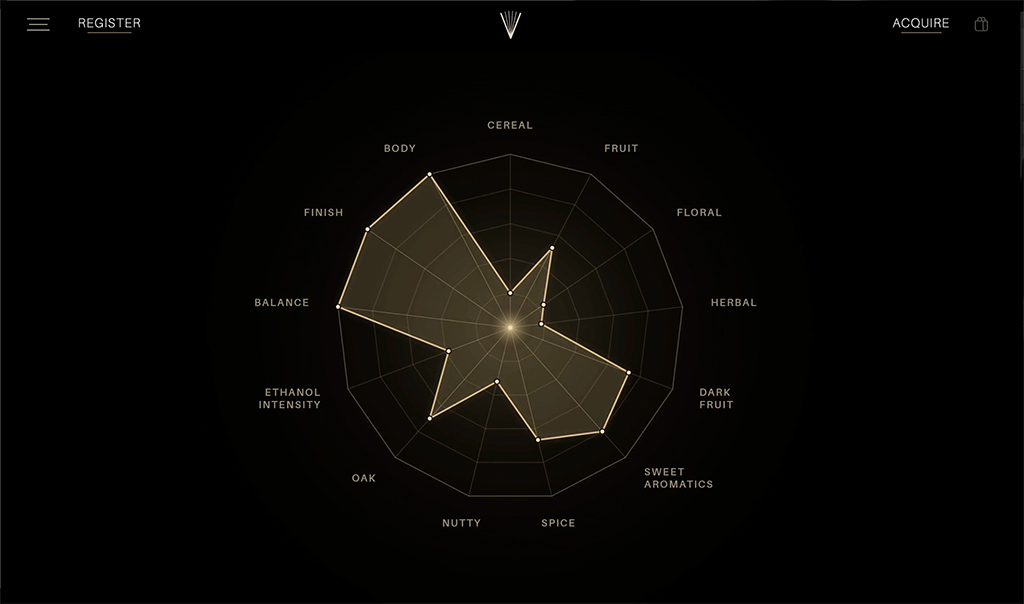
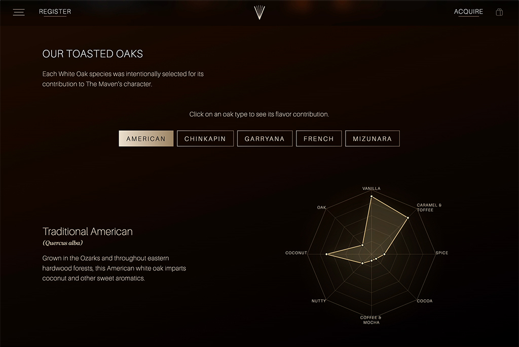
Bourbon devotees keep notes on everything, so we built tools worth noting: an interactive oak profile that shows how each wood shapes the flavor, and an animation that turns The Maven’s mark into the blend’s 13-point tasting profile.
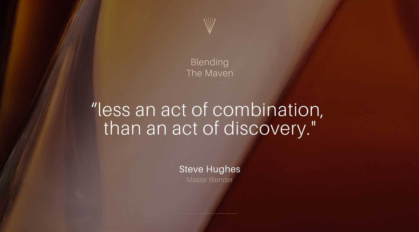
The Maven is meticulously blended, and the digital experience had to reflect that. The experimentation and curation behind the product suggested a powerful idea: the art and science of the blend.
Up close and under shifting light, the bottle's translucent layers and soft edges reminded us of Mark Rothko's immersive Color Field paintings. Rothko blurred boundaries, avoided fixed focal points, and created depth on an otherwise flat surface, drawing a powerful emotional response. His ideas suggested an art direction that connects The Maven to modern art and new approaches.
To keep it grounded in the real story, we layered subtle references to glass, ice crystals, and liquid. The result is a set of elegant animated backgrounds that tie the art direction to the science of The Maven.
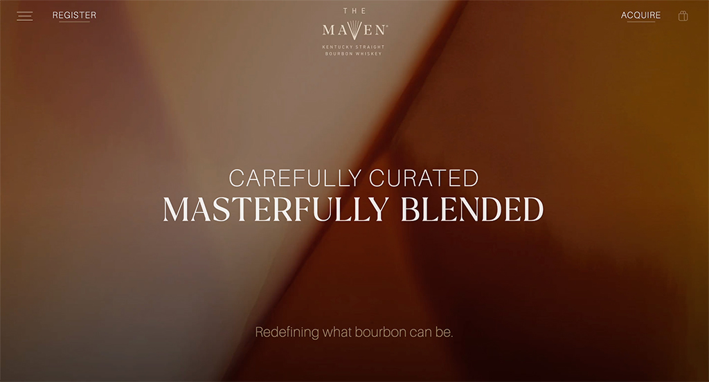
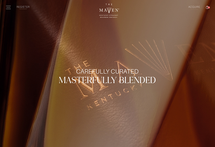
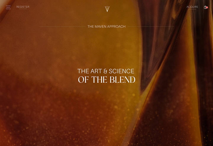
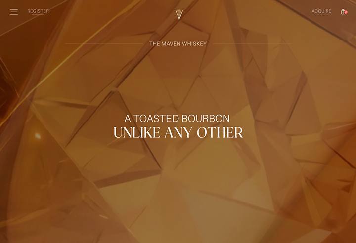
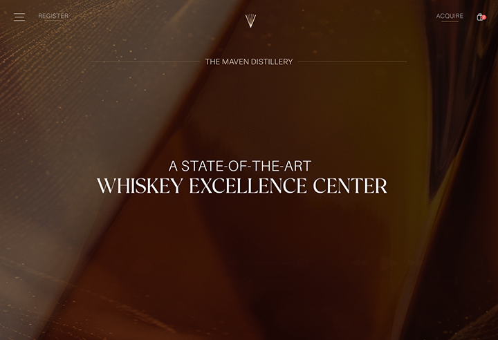
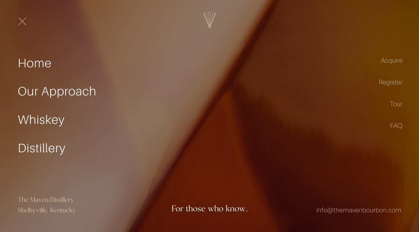
Blending implies motion, as does the bottle's geometry. We carried that sense through the site with transitions, layering, parallax and textured imagery. Elegant text animations and understated video tiles add polish and storytelling depth.
Because the concept phase built trust, we moved quickly to digital prototypes. From the first review, we showed core pages and supporting user journeys in near-final design, so stakeholders from legal to social marketing could weigh in right away. That kept the pace high. We built the site by hand in one continuous phase, adding secondary flows as they were ready.
Close collaboration gave everyone visibility and let the content evolve step by step. With almost no photography available at the start, we generated high-quality images as discussion pieces. They allowed for early changes in direction and clear guidance for photographers in the studio and on location in Kentucky.
AI as a working partner.
We used AI throughout the build to move forward on a tight timeline:
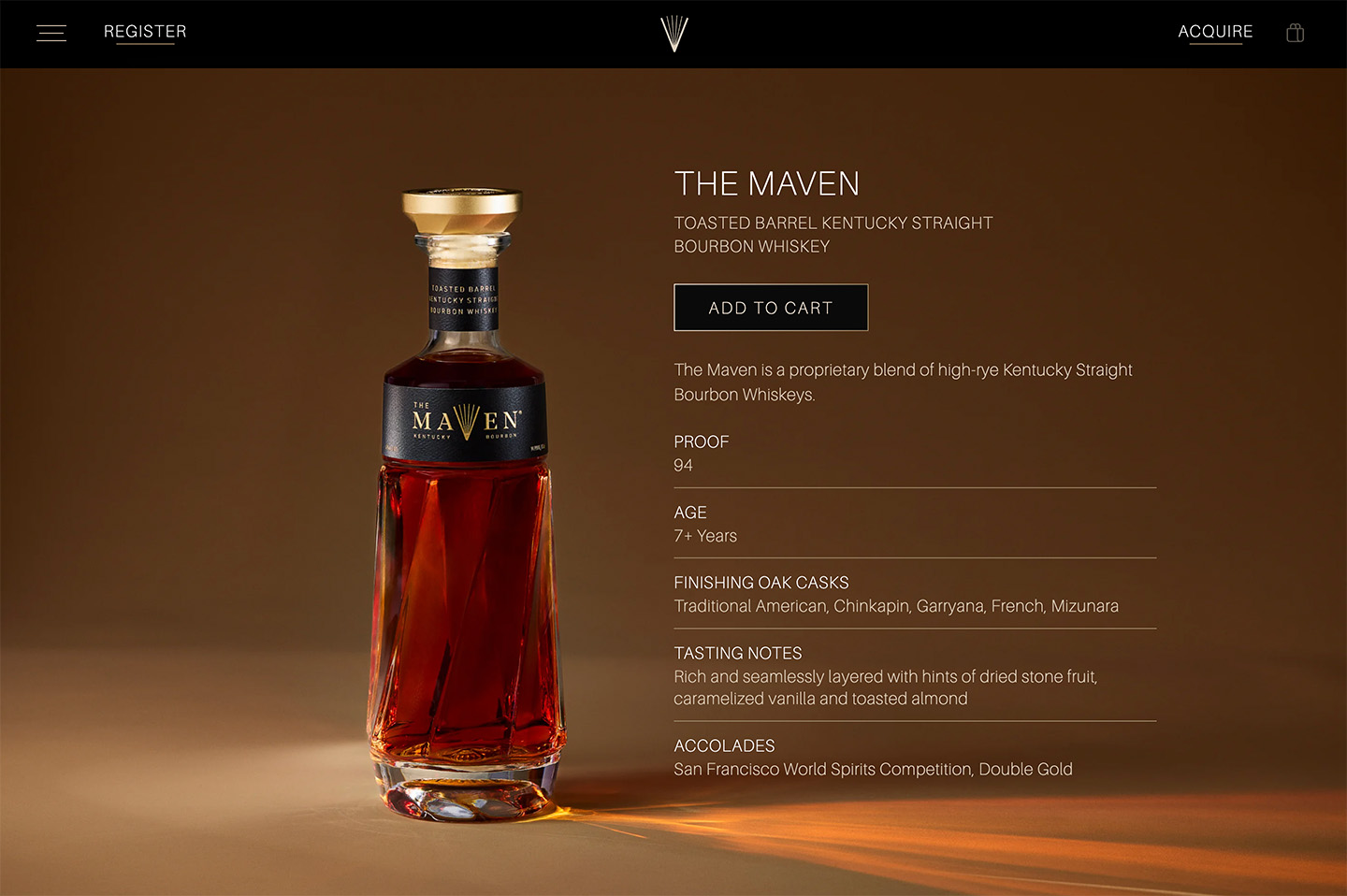
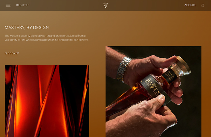
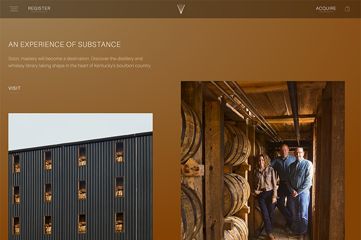
The proof is always in the details.
Guided by The Maven's Master Distiller and Blenders, we created animations that explain the overall flavor profile and the nuances that toasted oak adds. Toasting, used alongside conventional charring, is a deliberate choice that adds depth and helps define the bourbon's character.
We launched the site alongside the public release, ready for the first wave of press, including Breaking Bourbon and The Manual.
The first batch sold out immediately, a strong start for a new brand in a challenging market.
Since launch, we’ve added e-commerce using LiquidCommerce 2.0, so interest now is converted to sales.
"Supermoon are a great partner to work with. Agile, responsive and a clear creative point of view. They seemlessly balance the the art and science of building a website."
Site concept, design and build by Supermoon
Brand strategy by Tom Herbst
The Maven logos and bottle design by Sandstrom Partners
Product photography by New Work Agency (newwork.agency)