In the evolution to a more sustainable future, giving consumers better choices is key.
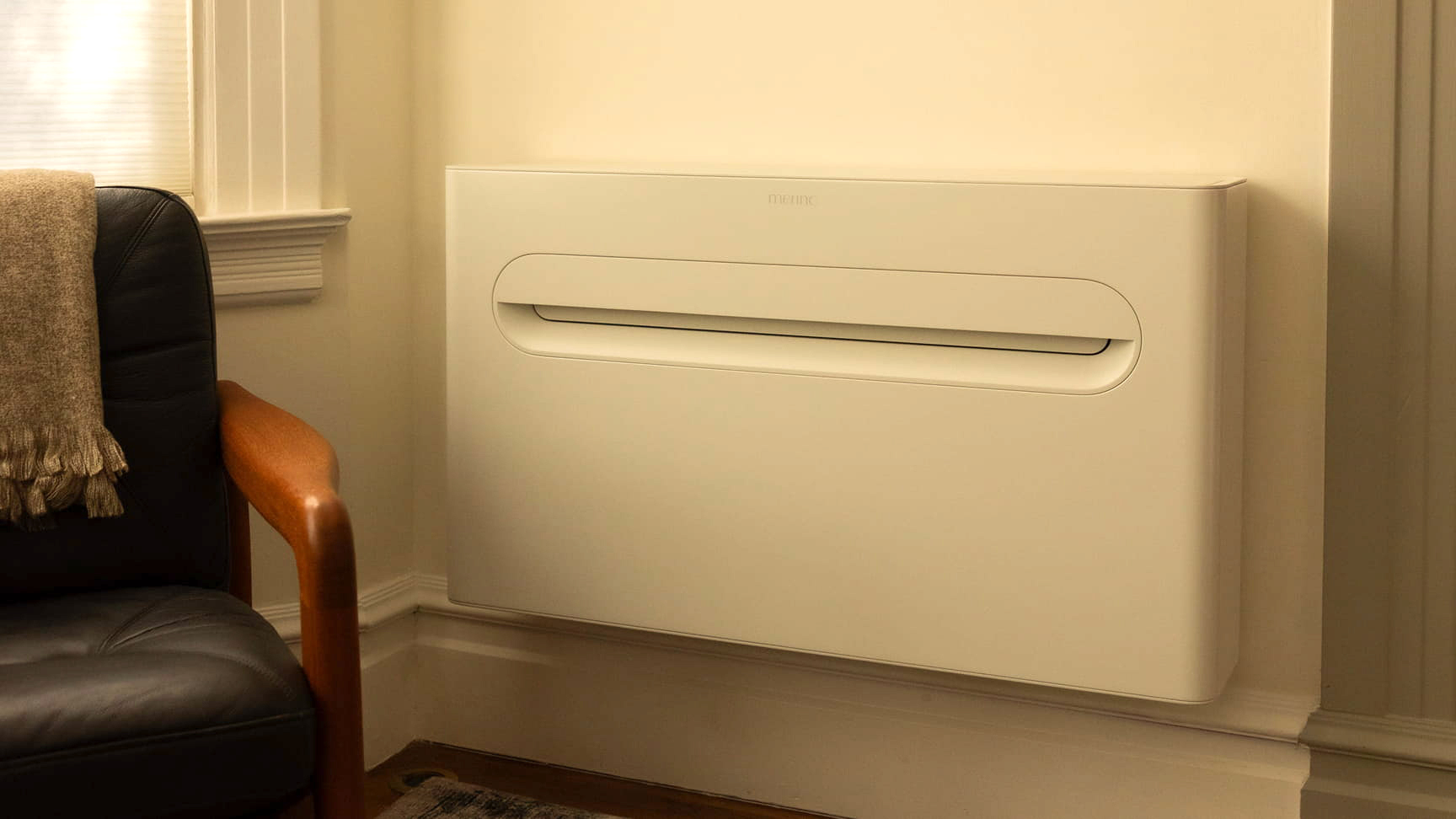
Merino Energy is on a mission to do just that. Focused on the electrification of the home, their debut product takes on one of the most difficult challenges for any owner, efficient heating and cooling, with a solution that's as elegant as it is effective. Meet the Merino Mono.
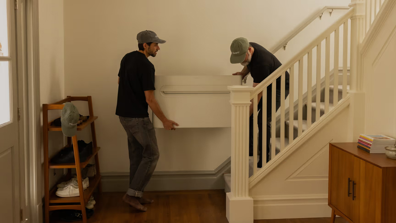
The team behind Merino, with backgrounds in the industry, knew that traditional heat pump systems involve significant challenges for buyers. Installs demand several days or even weeks, at high cost, and often involve modifications to a property. They also require bulky exterior units which may not be possible in many situations. Lastly, most units on the market look like cold, functional boxes and don't integrate well with modern home interiors. A new approach to the heat pump was needed.
Learn more on the Merino website.
Merino's founding team is made up of alumni from smart companies including Apple, Square, Quilt, and Gradient. When they reached out to Supermoon, they were still in stealth and finalizing their first product. They tasked us with establishing a 0-to-1 brand identity, with the objective of attracting investors, consumers, and partners.
We explored multiple brand strategy platforms together, each oriented around the values that drive Merino and the benefits they hope to deliver. Merino's ambition to ease the transition to the electric home is inspiring and altruistic to its core. But a mission statement for a brand like this also needs to be rooted in an idea that can resonate with consumers and supports their purchase decision process.
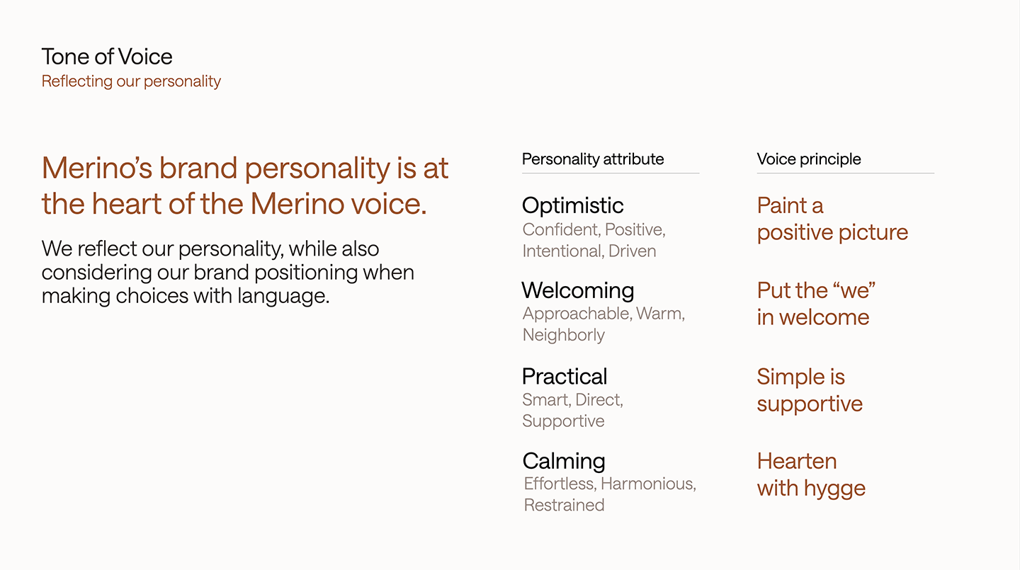
Combining high quality product ambitions and the desire to infuse a little welcoming Southern charm, we positioned Merino Energy as a home appliance maker engineering things to be easier. Personality wise, this is reflected in principles that underpin an optimistic, calming identity to support their aspirations for future growth.
The voice principles we developed needed to work across touchpoints ranging from social media, recruitment and events, to investor presentations and partner communications.
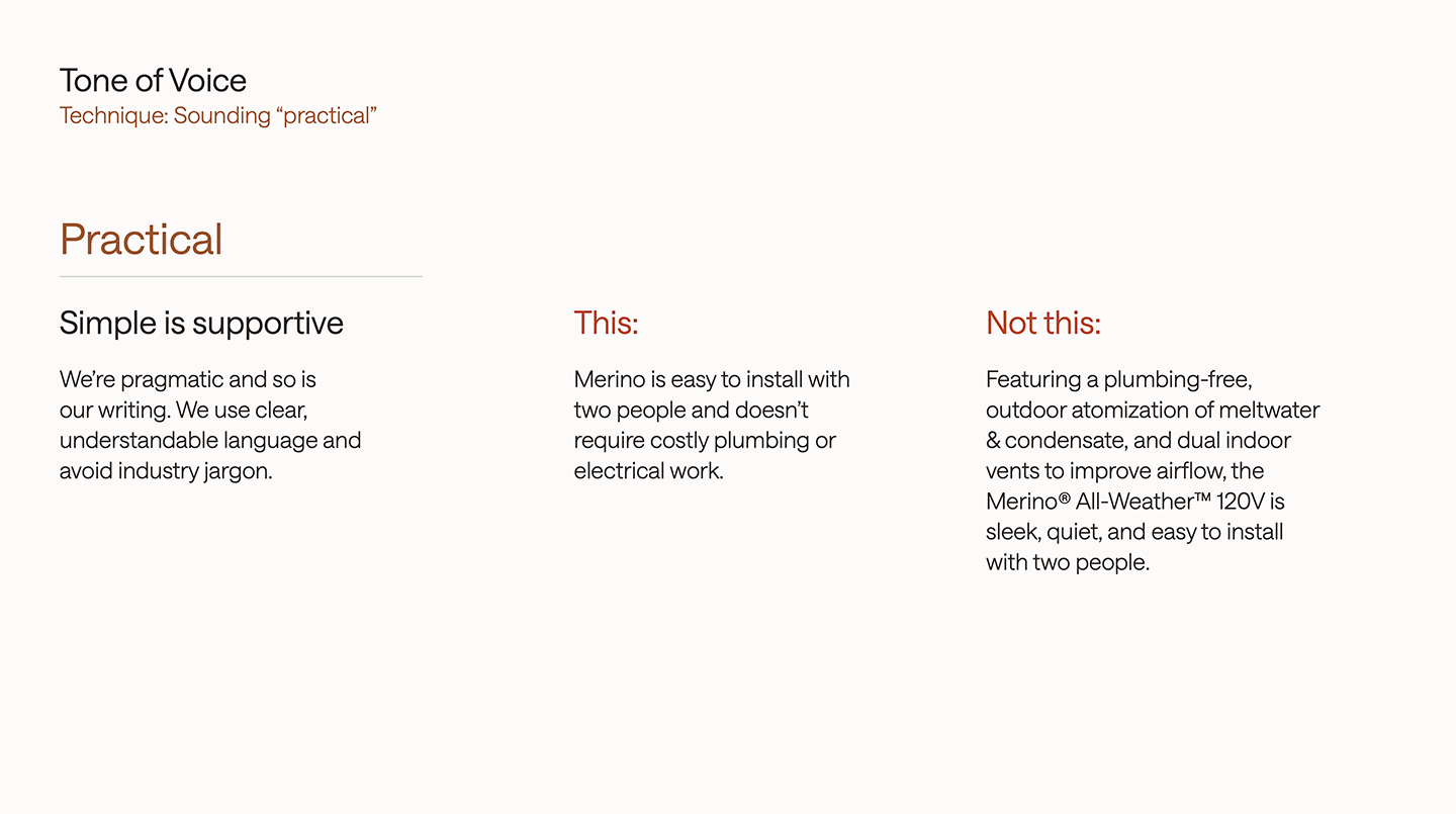
We translated Merino's personality attributes into practical writing techniques, to help their marketers deliver consistent, on-brand communications.
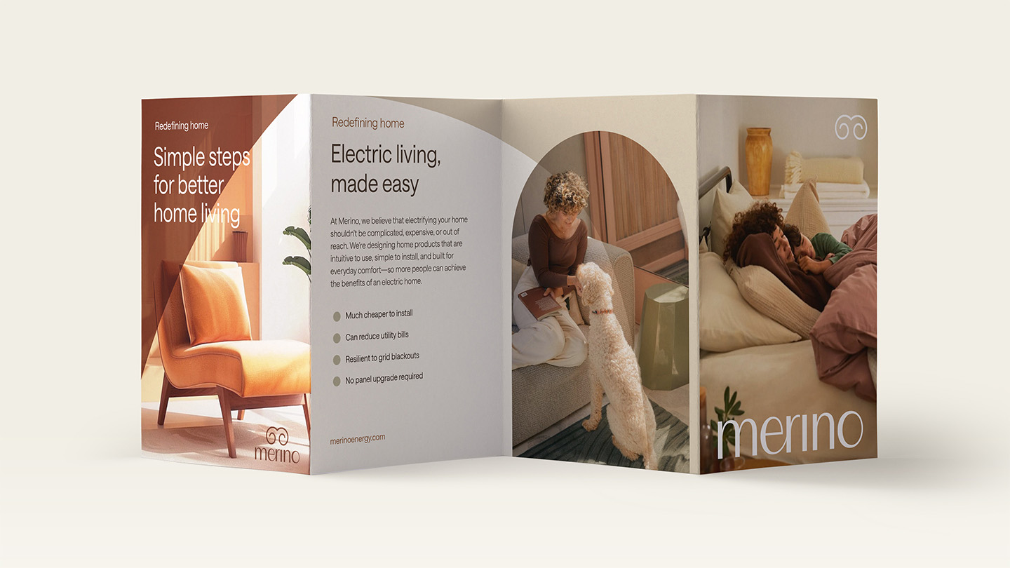
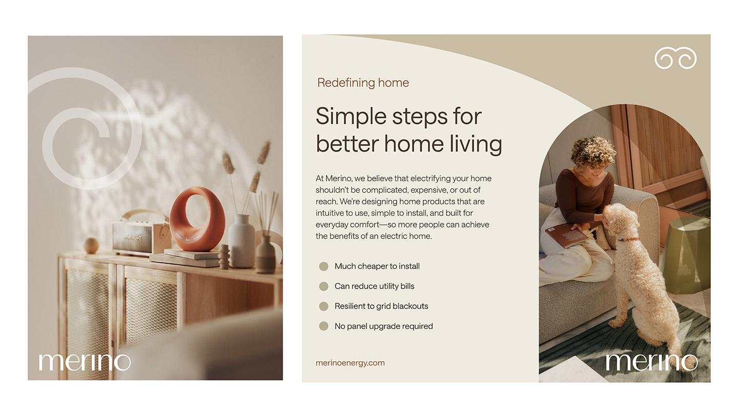
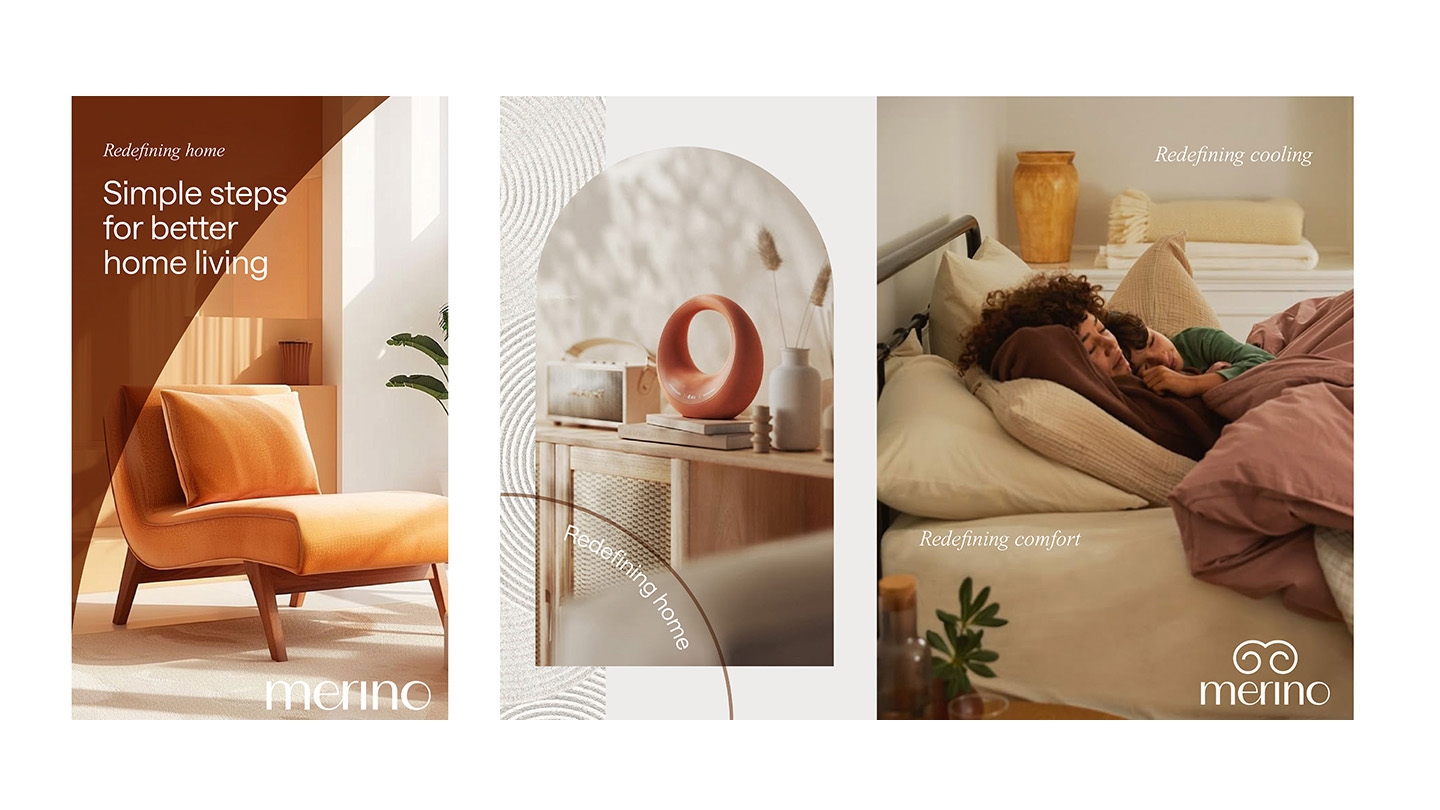
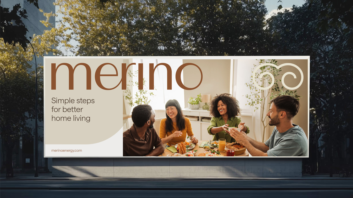
Merino's visual identity is constructed to support the welcoming, calming personality of the brand. The idea of "outdoor-indoor flow" that permeates it is not simply a nod to a more natural indoor climate, but reflects Merino's commitment to a more sustainable future.
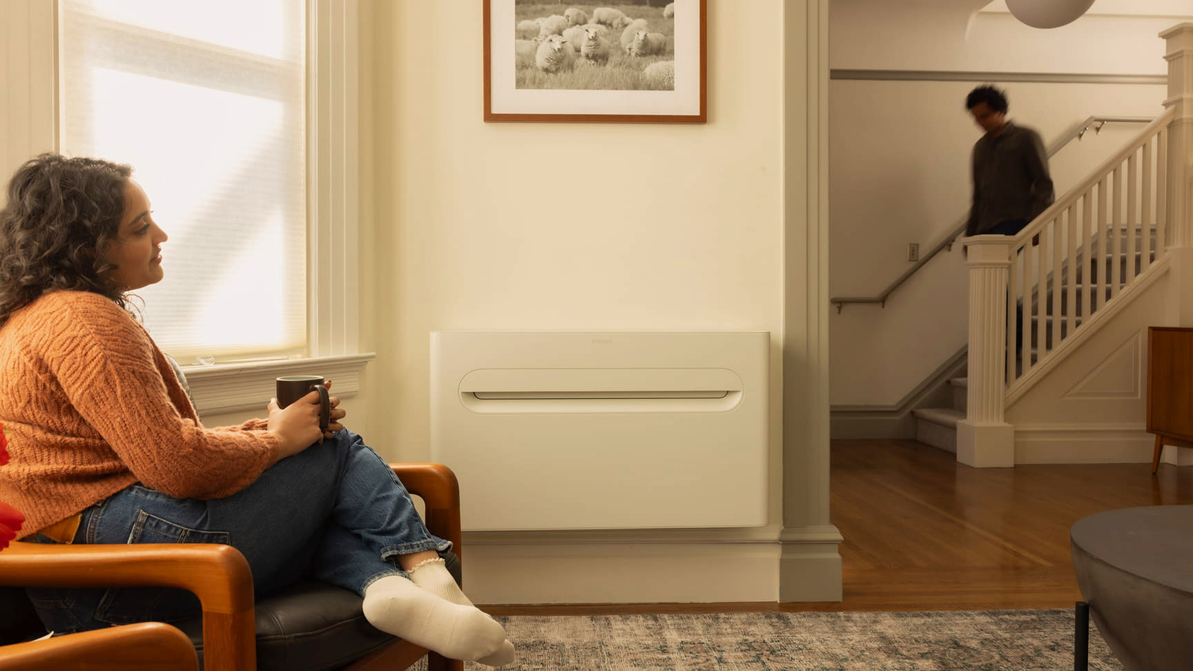
Flowing graphics speak to the debut product's key benefit: calm, gentle air circulation that doesn't intrude on your lifestyle. Whereas a conventional forced-air heating system or an air-conditioning unit is often noisy and intrusive as it cycles, the Merino Mono is quiet and keeps room temperatures at more consistent, comfortable levels.
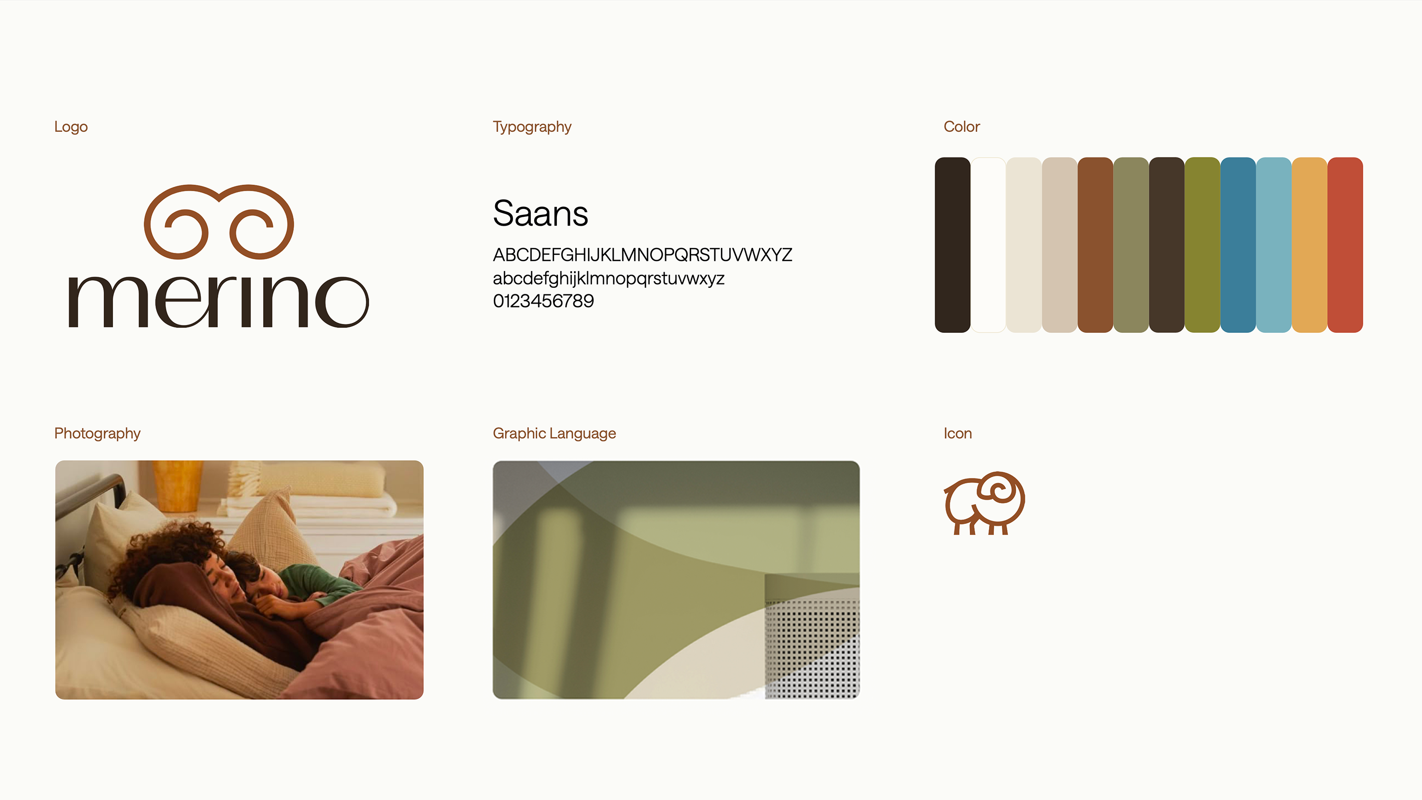
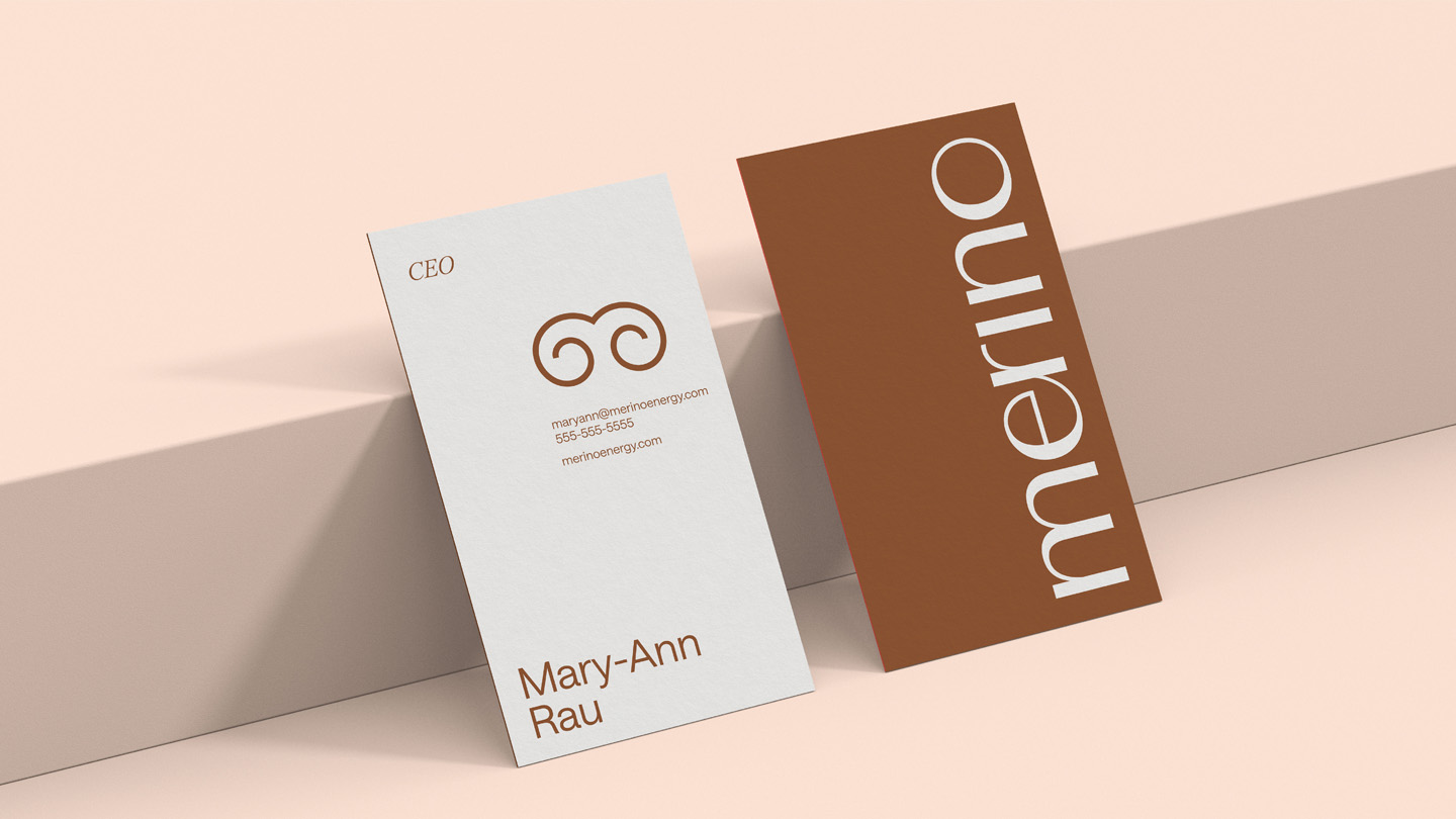
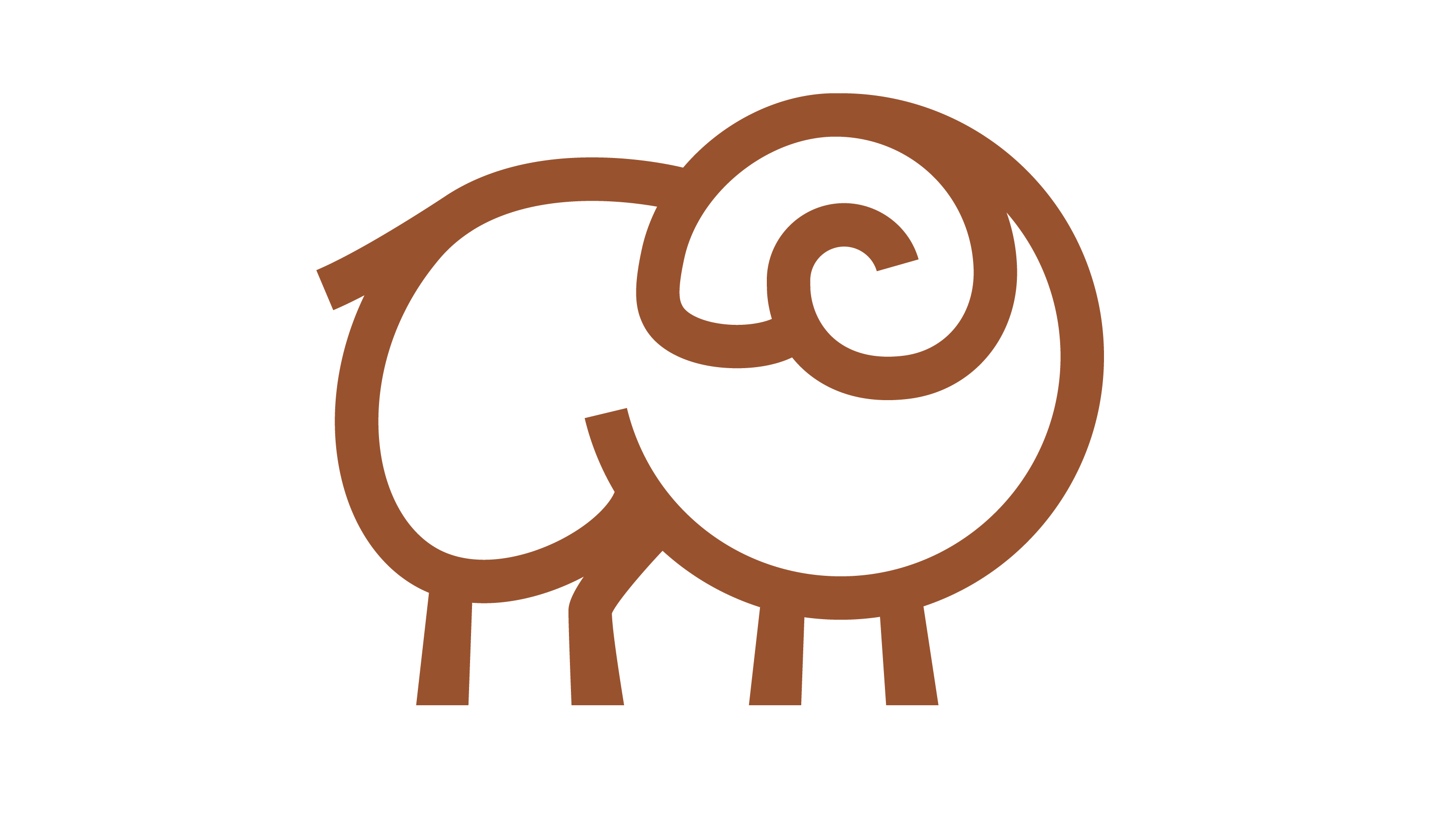
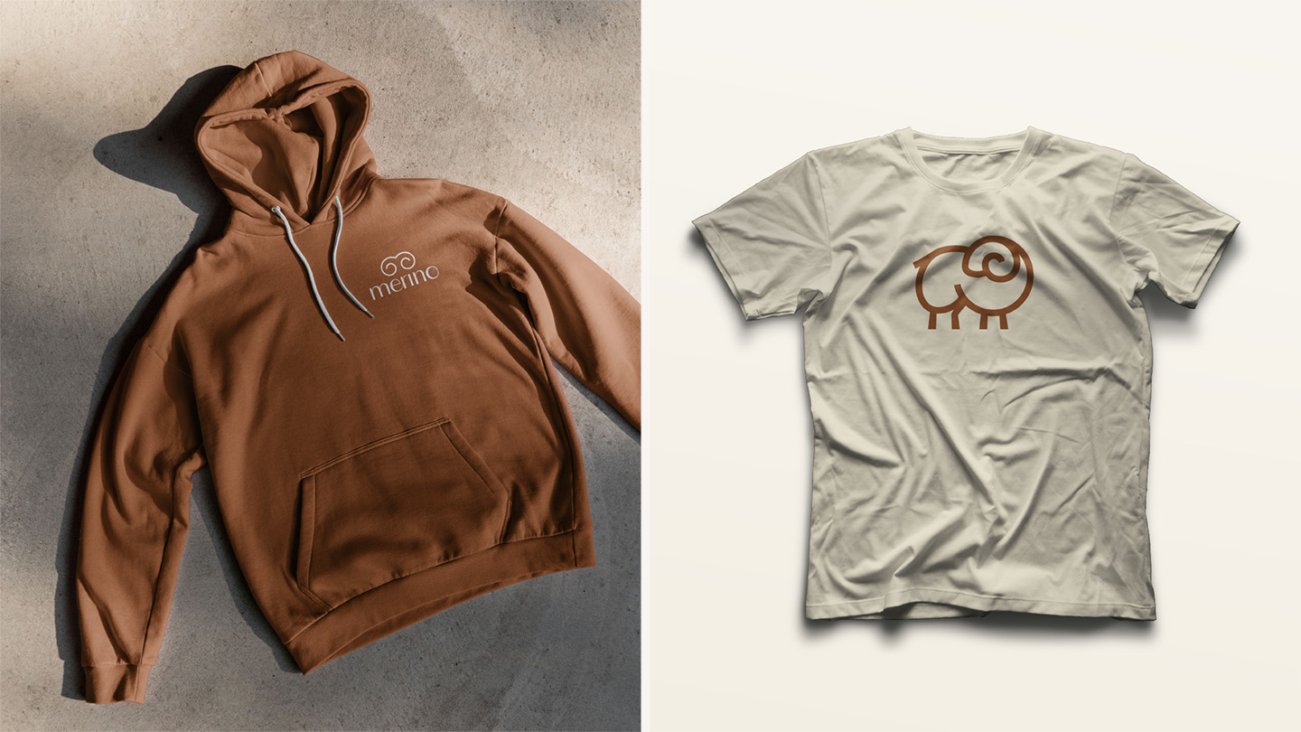
The Merino logomark is a simple, distinctive symbol based on the logarithmic spirals found in nature, intended to have a double read of calm air circulation and merino ram horns.
The detachable wordmark incorporates a single swash ligature to add organic motion. For timelessness and style, the wordmark deploys F37 Bergman (named after Ingmar Bergman), which is based on Hans Möhring's 1931 typeface "Florida". Not only does this make the wordmark more distinct and original, the typeface's unusual weightings bring movement and energy in their own right.

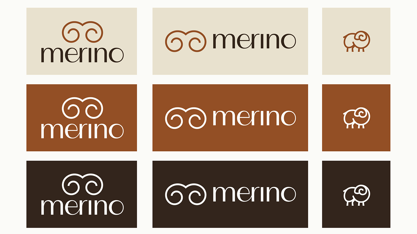
The Merino sheep icon is a lighthearted reference to the breed from which merino wool is derived. Primarily for internal team use, it's a playful secondary icon that also gives a little more personality to swag and packaging.
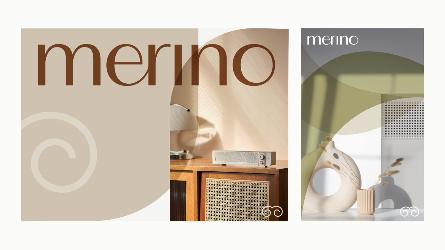
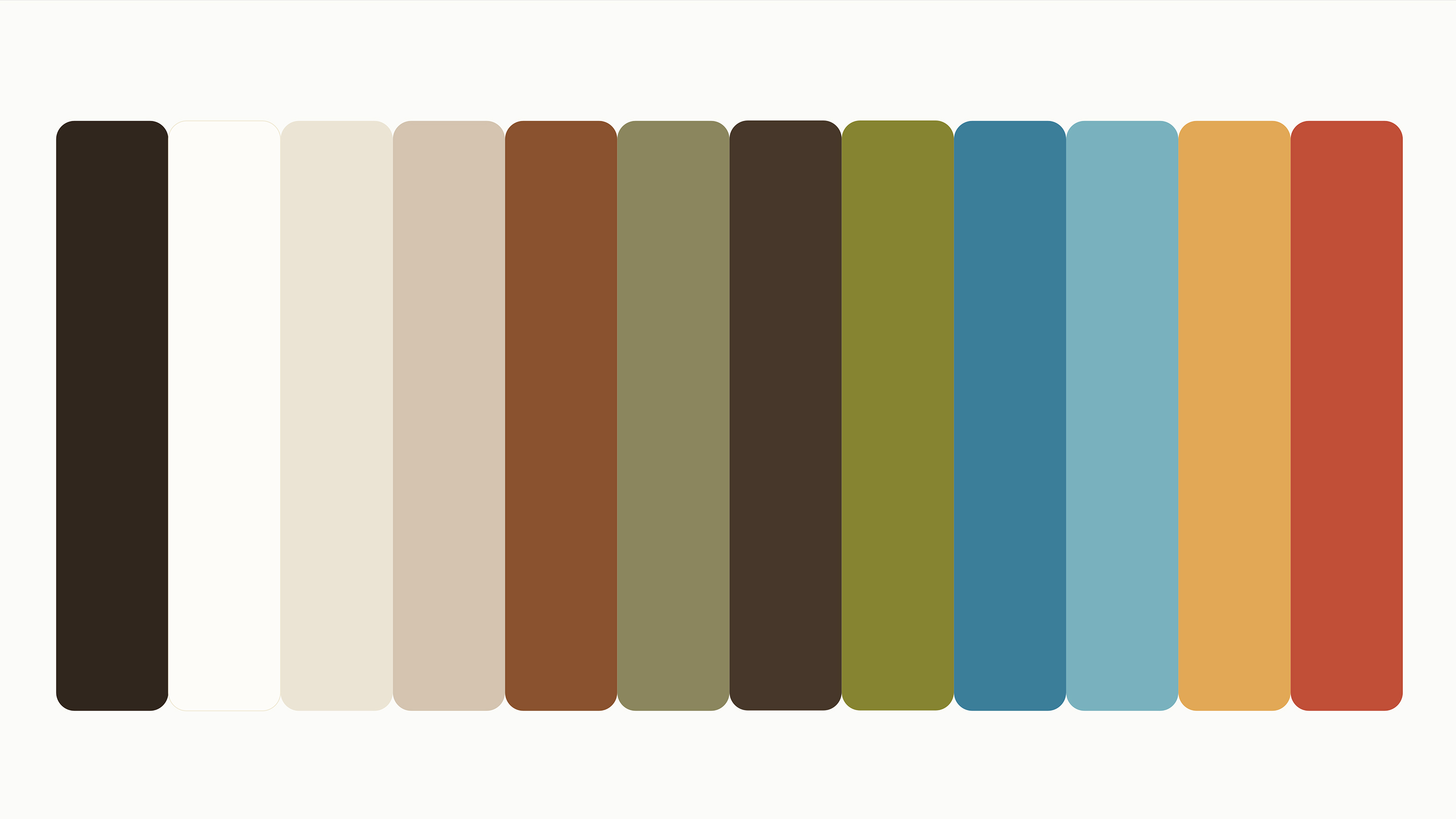
Merino's brand personality is welcoming, calming, and optimistic, influencing every color decision. Competitors tend default to "heating and cooling" technical cues, but we took the more strategic direction: a palette rooted in the natural world and scalable enough to carry the brand forward into the future, regardless of the products Merino make next.
As the range expands, Merino now has the ability to deliver an on-brand color option that feels at home in any room. Not simply a piece of tech, but a part of your overall interior concept.
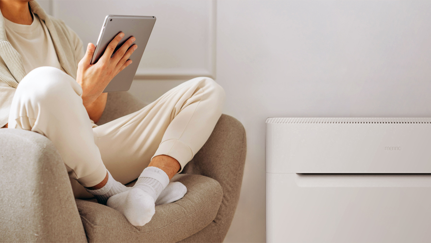
Simple and easy to reproduce, Merino's photography art direction is divided into product and lifestyle imagery. Product imagery leans simple and supportive, while lifestyle imagery is warmer and more welcoming.
In lifestyle imagery bringing a bit of "soul" into the images by including small imperfections, rather than the fully staged setups most brands use, helps make the imagery feel more welcoming and relatable.

Our holistic design philosophy and experience in integrating brand and product design helped us collaborate successfully with industrial designer Olivier Grégoire, as he developed a clean and distinct form language for the Merino Mono.

Merino began taking pre-orders for the Merino Mono in April 2026, immediately seeing strong demand buoyed by earned media from prominent pieces in Fast Company and TechCrunch.
The brand story also resonated with the investor community, unlocking a new round of funding to support their ambitious production schedule.
"Supermoon went above and beyond for Merino.
David and Mike are both fantastic to work with, both as a team and individually. When we first engaged with Supermoon, we only had a name and a product. They spent several full days with us onsite to brainstorm and identify the foundation of the brand: our purpose as a company. Their approach resulted in a cohesive brand identity that was uniquely Merino. It's authentic to us as founders, yet differentiated for our space.
Beyond the strategic work, they also executed and delivered high quality brand assets on a tight timeline. It is incredibly rare to find this combination of raw talent, speed of execution, and affable personalities all in one team."
Mary-Ann Rau
CEO, Merino Energy
Industrial design by Olivier Grégoire
Website development by AllTrue
In-situ photography by Danielle Navratil